Best Practices for Data Visualization in Excel

Best Practices for Creating Effective Data Visualization in Excel
1. Start with the Right Chart:
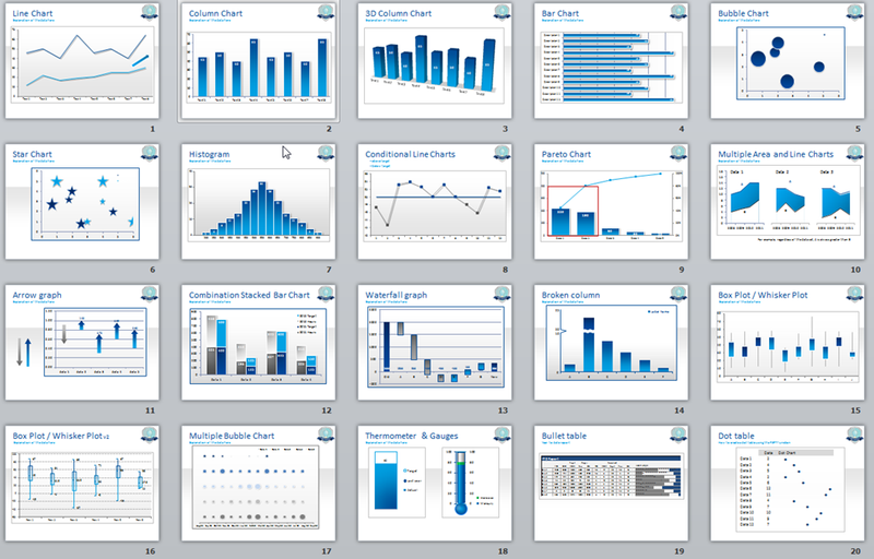
The type of chart you choose determines how well your data is understood. Different charts serve different purposes:
- Bar charts work best for comparing categories.
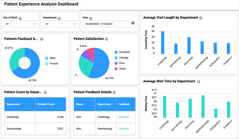
- Pie charts are useful for showing proportions, but should only be used when there are three or fewer categories. After all, you don’t want your stakeholders staring at a pie chart with a dozen rainbow-colored slices trying to figure out what’s going on, do you?
- Line charts are ideal for showing trends over time.
- Histograms help visualize the distribution of numerical data.
Each chart type serves a different need. Think about what you want to communicate before choosing your chart. Misusing a chart can lead to confusion, like trying to represent continuous data with a pie chart.

2. Simplify the Presentation
One of the biggest mistakes in data visualization is overcomplicating things. It’s tempting to include as much information as possible, but too much detail can obscure your message. A well-crafted chart should highlight the main insights you want your audience to understand, nothing more. Ask yourself: What’s the key takeaway here?
3. Maintain Consistent Scales
If your visualization is comparing data points, it’s crucial that your axes and scales are consistent. Inconsistent scales can exaggerate differences or obscure key insights. Imagine if you’re comparing quarterly profits, but each bar in the chart uses a different scale—your stakeholders might think one quarter outperformed the others significantly when in fact, the difference was minimal.
4. Label Everything Clearly
Clear labels are essential for understanding your data. Always include:
- Descriptive titles to explain what the chart is showing.
- Axis labels to indicate what each axis represents.
- Legends when using multiple data series.
The goal is for anyone looking at your chart to grasp its meaning without needing you to explain it. Avoid vague labels like “Sales,” and opt for more detailed ones like “Total Sales in Q1 2024”.
5. Limit Your Use of Colors
Color can enhance your visualizations, but it should be used thoughtfully. Too many colors can overwhelm viewers and dilute your message. Stick to a simple color palette—use different shades of the same color for related data and contrasting colors for key differences. A common mistake is using too many bright or clashing colors that draw attention away from the actual data. You don’t want your audience focusing on how the chart looks rather than what it tells them.
6. Avoid 3D Charts
Excel offers 3D chart options, but they often cause more harm than good. 3D effects can make it harder to interpret data accurately, especially when viewers need to distinguish between data points. While they may look visually appealing, they add unnecessary complexity and can lead to misinterpretations of the data. Stick with 2D charts, which are easier to read and understand.
7. Incorporate Advanced Visuals Thoughtfully
As you become more familiar with Excel, you might want to explore advanced visuals such as:
- Heat maps, which show patterns or trends across data points.
- Bullet charts, which help track performance against a benchmark.
These visuals can be highly effective, but they’re best used when you have more complex data to convey. Make sure they serve your story rather than complicating it. If a simple bar chart will do the job, don’t overthink it.
8. Tell a Story with Your Data
Visualizations aren’t just about displaying data—they’re about communicating insights. Before creating any chart, ask yourself: What’s the story I’m trying to tell? Every decision, from the type of chart you use to the colors you choose, should reinforce that story. Whether you’re showing growth, decline, or a trend, your data should guide the viewer to the right conclusion.
The human brain processes visuals much faster than text or numbers. Your goal is to make that process seamless. Imagine your data as the story, and your chart as the narrator—both should be working together to guide your audience through the information.

9. Test Your Visualizations
After creating your chart, take a step back and test it. Show it to someone unfamiliar with the data and see if they understand the main message. Does the chart tell the right story? Does it highlight the key insights? Testing helps ensure that your visualization communicates effectively and avoids common pitfalls.
Conclusion
Data visualization in Excel is more than just creating charts—it’s about telling a clear, compelling story with your data. By following these best practices, you can ensure your visualizations are not only easy to understand but also impactful. Remember, simplicity, consistency, and clarity are key. So next time you’re designing a chart, ask yourself: Is this the best way to tell my data’s story?
Happy charting!
Babatunde Oluwapelumi Adedoyin
