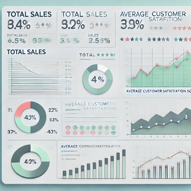
Mastering Dashboard Design: A Guide to Creating Effective Dashboards

What Is a Dashboard?
A dashboard is a visual representation of key data points that allows users to monitor, analyze, and make decisions. It typically consolidates data from various sources into a single, easy-to-understand view. Dashboards are widely used in fields such as finance, marketing, healthcare, and IT.
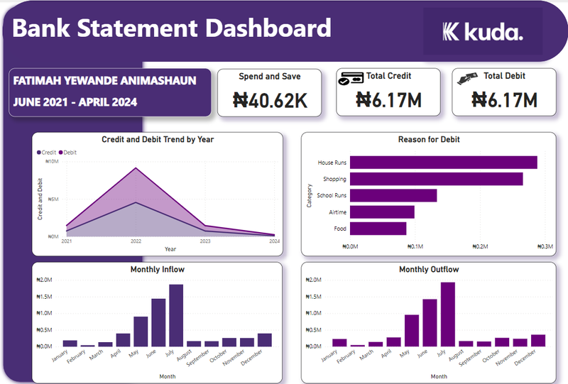
Example of Dashboard:

1. Understand Your Audience and Purpose
Before designing a dashboard, it’s essential to know who will use it and why. Consider the following:
- Who is the audience? Executives, managers, analysts, or frontline workers?
- What are their goals? Quick insights, deep analysis, or performance tracking?
For example:
- An executive dashboard might focus on KPIs (Key Performance Indicators) such as revenue, profit, and customer satisfaction.
- An analyst’s dashboard may dive into granular data trends, requiring more interactive elements.
Tip: Keep it concise.
Your audience doesn’t need all data—just the most relevant metrics to help them make decisions.
2. Choose the Right Visualizations
Choosing the right type of data visualization is critical for an effective dashboard. Below are common visualization options:
- Line charts: Great for showing trends over time.
- Bar charts: Useful for comparing different categories.
- Pie charts: Best for showing parts of a whole (though overused, they can be confusing if there are too many categories).
- Heat maps: Good for showing intensity of data in various regions.
- Tables: Ideal when precision is required, but they can clutter your design if overused.
Tip: Use visualizations that complement each other. A combination of line graphs and bar charts can offer both temporal and categorical insights at once.
3. Prioritize Information with a Hierarchical Layout
Arrange your dashboard elements by importance. The most critical information should be the most prominent, typically at the top left, where the eyes naturally go first. This hierarchy allows users to process information quickly.
- Primary data: KPIs or critical metrics should be large and easy to spot.
- Secondary data: Supporting information should be smaller and below or to the right of the primary data.
Tip: Use spacing and grouping to avoid clutter. Allow breathing room between visuals for a cleaner look.
4. Use Color Wisely
Color can make or break a dashboard. Done well, it enhances understanding; done poorly, it causes confusion.
- Consistent color coding: Use consistent colors for similar data. For example, if profit is green in one chart, keep it green in all charts.
- Avoid excessive colors: Too many colors can overwhelm the user. Stick to 4-5 main colors for clarity.
- Use color for emphasis: Highlight important changes, alerts, or anomalies with brighter or contrasting colors.
Tip: Use a color palette that aligns with your brand or organizational standards for consistency across platforms.
5. Ensure Responsiveness and Interactivity
Dashboards are often accessed on multiple devices—desktop, tablet, or mobile. Ensuring that your dashboard is responsive to different screen sizes is critical for usability.
Additionally, adding interactivity can enhance the user experience:
- Drill-down features: Allow users to click on data points to see more details.
- Filters: Give users the ability to filter data by date, category, or other parameters.
Tip: Keep mobile users in mind by ensuring that critical data points remain visible and accessible on smaller screens.
6. Test and Iterate
Designing an effective dashboard is an iterative process. After the initial design:
- Test with users to ensure it meets their needs.
- Collect feedback on usability, clarity, and functionality.
- Make adjustments based on real-world use cases.
Tip: Use tools like A/B testing to see which designs work better in practice.
Data Integrity and Real-time Updates
Finally, no dashboard is useful if the data is outdated or incorrect. Ensure that your dashboard is connected to reliable data sources and set up to update in real-time (or near real-time) to provide users with the most accurate information.
Tip: Include a timestamp showing when the data was last updated, especially if real-time updates are not possible.
Conclusion
Mastering dashboard design is about blending functionality with visual appeal. By focusing on user needs, using the right visualizations, and maintaining a clean and responsive layout, you can create dashboards that provide real value. Start small, gather feedback, and continually refine your designs to meet the evolving needs of your users.

Author: Fatimah Animashaun
LinkedIn: https://www.linkedin.com/in/fatimah-animashaun
