Unleash Data Visualization Power with Conditional Formatting in Excel

What is Conditional Formatting?
Conditional formatting in Excel is a dynamic feature that changes the appearance of cells based on predefined conditions or rules. The numerous ways this change may come include:
Color Scales: Applies the pattern of gradient colors according to the values.
Data Bars: Shows bar graphs within cells, making it easier to compare information.
Icon Sets: Displays data in visually represented symbols, such as arrows, stars, and flags, showing the trend of the data.
By using this tool, users can get valuable information without having to go through the entire data manually, while in just a few simple steps, patterns, trends, and anomalies in a large dataset can be identified.
How Conditional Formatting Helps in the Effective Interpretation of Data.
The real power of conditional formatting lies in its ability to highlight the most important points of your data. Whether you are keeping track on your sales performance, employee productivity, or financial metrics, conditional formatting converts your data set into an even more viewable format.
In implementations involving amounts, to name just one example, conditional formatting can highlight outliers-for instance, unusual expenses or a sudden surge in sales. This helps draw attention to unusual figures that warrant further attention. When applied to time series, such as sales by month, color scales can highlight trends, such as if performance is rising or falling. We can also use different formatting rules on a dataset to emphasize data belonging to distinct categories, such as departments, locations, or product types.

How to Apply Conditional Formatting
Step 1: Highlight the Range
Highlight the range of cells you want to format. You can highlight one column, one row, or even an entire table.
Step 2: Select the Rule
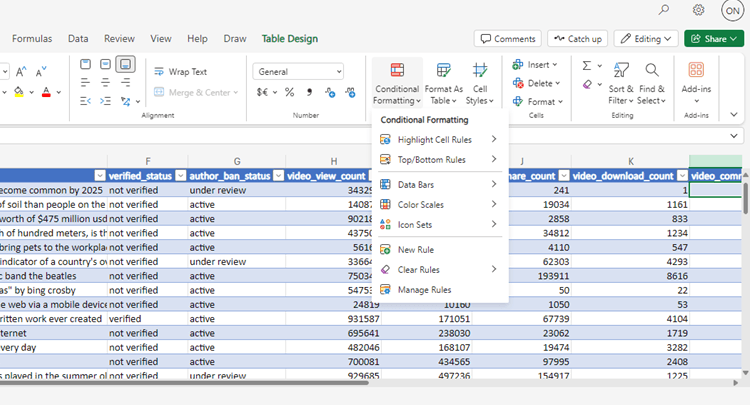
Click the 'Conditional Formatting' in the 'Styles' group on the 'Home' tab. Excel has a few defaults formatting rules, including color scales, data bars, icon sets, and so on. You can also define your rule with a formula.
Step 3: Refine the Rule
After you choose a rule type, refine its parameters. For instance:
Color Scales: two color grade or three-color grade.
Data Bars: The color and length of bars would be changed according to the relative values in your data.
Icon Sets: You can assign various icons such as arrows, traffic lights, or flags which would change based on whether the values go up or down.
Some Realistic Examples of Using Conditional Formatting Highlighting Top Performers
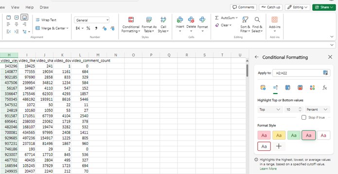
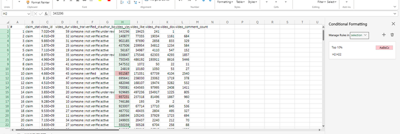
You can apply the "Top Rules" option to any financial or performance-based dataset. Say, you want to highlight the top 10% of sales performances. You instantly identify who or what outperforms and who or what must do better.
How to Apply:
- Highlight the data range.
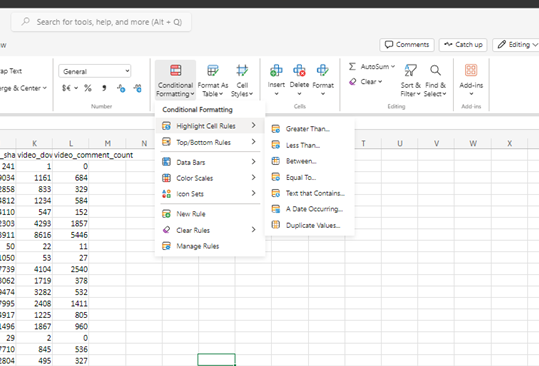
- Click 'Conditional Formatting' > 'Top/Bottom Rules' > 'Top 10%'.

- Set the formatting to change cell colors for the top 10% of values.
- Color Scale Maps Summary Data: By applying light to dark shades of color, color scales are a good means of showing the distribution of data. For example, an exam score data set might use a green-to-red color scale where higher scores are shaded green and lower scores red, with yellow as the midpoint.

Business Intelligence Benefit of Conditional Formatting.
With information visualized, decision-making is a great deal easier; key metrics or problem spots can be spotted in an instant with decision-makers taking appropriate action if necessary.
Automated analysis through conditional formatting eliminates the need for data digs, and the relevant trends and outliers are automatically flagged when the latest information arrives. Another big advantage is improved communication; reports that include conditional formatting can be better communicated and understood between teams, whereby even non-technical stakeholders can grasp the key insights in no time.
In a nutshell, Excel's conditional formatting helps enhance analysis, detects patterns, and empowers data-driven decision-making. By the time one masters its rules, customization, and advanced techniques, any analyst-at a starter or professional level-can elevate data interpretation and presentation to a different level.
Omamo Moses Namayi
